Since the emergence of CSS3, web developing field has touched the new horizon of its scope. CSS3 has given developers a new angle to think and lighten up many ideas to work upon. It has been many years when CSS3 hit the market but still there are a lot of features which are not commonly used by developers. CSS3 has solved many problems by introducing many dynamic abilities, CSS3 animations are among the best findings of CSS3. Developers can create smooth, sleek, eye catchy animations with the help of @keyframes.
Salient features of CSS3 @keyframes animations:
- No need of JS
- Pure CSS code
- W3C valid code
- Cross browser compatible
- Mobile devices compatible
- Easy to understand
Ever imagined of simple animation rendering day & night? Have a look here. You can see rising Sun from left bottom corner to top middle of the screen, staying and then setting down to right bottom corner of the screen. You would notice clouds or floating left to right. How did you like the color changing effects on all elements? These all are happened due to CSS3 @keyframes.

CSS3 @keyframes Syntax
A certain set of instruction is followed to get the desired result from @keyframes. For this, at-rule or “@ rule” is followed, @ rule is introduced for many other specifications. Keyframes also follow this @ rule. The following example will make you more understand.
@keyframes animation-name{
    set of code here , what we do with our animations
}
In the first line, animation-name can be the name of the animation. It is totally developer’s choice to use whatever name they wanted to use. It is just like writing a function in PHP or JS and call it where it is required, or we can say making mixins in SCSS. In between brackets set of code is written as per required animation.
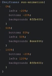
Name of the animation is sun-animation ( we’ll use it later ). We have divided animation into 3 easy steps.
Step1: At step 1, when the animation starst at 0%, the position of the sun is described as its starting color. In start sun is on a negative side of the main frame it means at start sun is not visible.
Step2: At step2, when the animation is 50% lapsed, the position of the sun is set to top middle of the screen with its color changed to yellow.
Step3, At step3, when the animation is at its last point, the sun is supposed to be out of the frame with its starting color.
Order of the rules will not affect the output, the animation will run with the same sequence. Instead of 0%, 50%, 100% we can use ‘from’ and ‘to’ elements, it will not change the output. If no set of rule(percentage or from to) is declared, still browser will construct it to play the animation. But vendor prefixes are displayed before ‘@keyframes’.
-moz-@keyframes sun-animation{
}
Playing the animation
How would browser come to know that which elements would be animating with the said @keyframes. For this, we have to associate the animation with some elements to animate, otherwise no animation will take place.
.sun{
    animation-name: sun-animation;
}
Here we see, the animation-name property is introduced. Before this, this property was not used. By its name, it is clear that we are calling an animation function to perform some kind of dynamic work on the screen. Moreover, for its value ‘sun-animation‘ is called, we have to make it sure that its value must be an identifier. If there is no identifier then no animation will took place. Every HTML element with class .sun will have these animation effects on the screen.
Animation’s Duration
Now a question raised, for how long should an animation run?
.sun{
    animation-name: sun-animation;
    animation-time: 20s;
    animation-timing-function: ease;
}
Here we see another new property ‘animation:time‘, it describes that how long will it take to complete one iteration. Its value must be in units of seconds milliseconds (5000ms), decimal units(4.5s), like we used the 20s. So our sun will take 20 seconds to complete its one iteration from one of the screena to another corner of the screen.
‘animation-timing-function‘ is the property which decides how does the animation progress in one iteration. The default value of this property is ‘ease‘. If we don’t write this property, by default ‘ease’ will be used. For a complete list of values check this.
Animation Iteration & Direction
What will you notice in the code below:
.sun{
    animation-name: sun-animation;
    animation-time: 20s;
    animation-timing-function: ease;
    animation-iteration-count: infinite;
    animation-direction: normal;
}
Another property ‘animation-iteration-count‘ is new to us. Well, this property controls the iterations of the animation whether how many times cycle of animation will be played. If it is set to ‘1’ then the animation will be played only once. We used ‘infinite’ that described animation will never stop.
Further, ‘animation-direction‘ controls the direction of the animation. Its value can be normal or alternate. For the alternate value, it must be sure that iteration count of animation is more than 1.
Animation Fill Mode, Delay & Play State
Take a glance at the code below:
.sun{
    animation-name: sun-animation;
    animation-time: 20s;
    animation-timing-function: ease;
    animation-iteration-count: infinite;
    animation-direction: normal;
    animation-delay: 5s;
    animation-play-state: running;
    animation-fill-mode: forwards;
}
‘animation-delay‘ makes a delay before the start of the animation. We can set its value in negative too, wondering how will it work? You should give it a try yourself and share your experience with us.
‘animation-play-state‘ property lets you decide when to pause animation and when to make it run. Go check the example I share on top, mouseover on clouds will make them stop and mouse left will make them play again. Now you understand what exactly this property do with animation.
Another property, ‘animation-fill-mode‘, controls the execution of elements in animation. For example, ‘forward‘ will run from 0% to 100% and ‘backward‘ will run from 100% to 0%. To understand this more give it a try yourself.
Shorthand
Like all other CSS properties we can use this in shorthand as well. All of the six properties can be defined in one go except animation-play-state and animation-fill-mode.
.sun{
    animation: sun-animation 20s ease infinite;
}
Conclusion
Following browsers give full support to @keyframes.
- Chrome 2+,
- Safari 4+,
- Firefox 5+,
- IE10 PP3,
- iOS Safari 3.2+,
- Android 2.1+.
References are listed below: